My site is looking pretty good, but the top line is bothering me.
It’s the site’s title, but it looks no different from any other paragraph.
I could wrap it in <strong>
to make it visually stand out, but there’s a better, more intentional, way to mark it:
<h1>.
Headings
<h1> stands for “heading one”. There
are a slew of numbered heading tags in html, from <h1> through <h6>.
<h1> is intended to be the primary
heading of your page, perfect for a title.
Adding it, my page looks like so:
 <h1>Zach World</h1>

<p>This is my <em>personal</em> webpage. Stay awhile!</p>

<p>I think <strong>birds</strong> are cool.</p>
and like so:
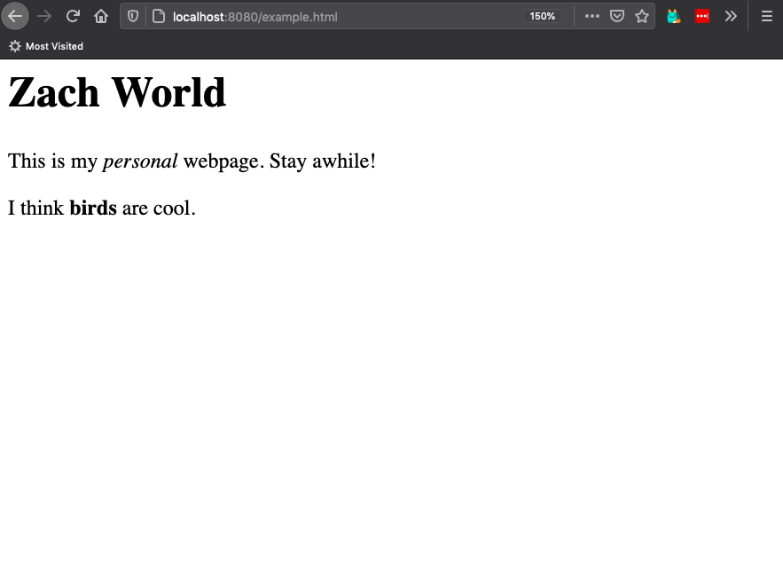
This is great. The line looks properly titular in the browser, but also in the source code. Someone with a bit of knowledge in HTML could scan my text and get an understanding of how my page is structured, without using the browser at all.
In other words, my code holds semantic meaning.
The importance of semantics
Having a cool website will make you friends.
Friends are cool and it is good to make as many as you can.
Not everyone experiences the web in the same way. Some people may have low or no sight, for example, and will use a screen reader to help navigate the web. (Maybe that’s you, right now!)
In this case, the visuals of a page are meaningless, the structure is what’s important.
A confusingly structured webpage may look good in the browser, but will be a mess when read by a screen reader. This could make the site annoying to navigate, and make some people unable, or unwilling, to visit it and losing that possible friendship.
This is the exact thing we didn’t want.
A new definition
We should expand our notion of a webpage.
A webpage is a folder of text and media files broadcast from a computer and interpreted by browsers or other devices.
If you write semantically meaningful html, it can be interpreted successfully no matter how someone comes to it.
One more example
Let’s say that I quite like how Zach World looks, and I want my last line to be equally big.
a simple way I could do this is to wrap that line in <h1> too.
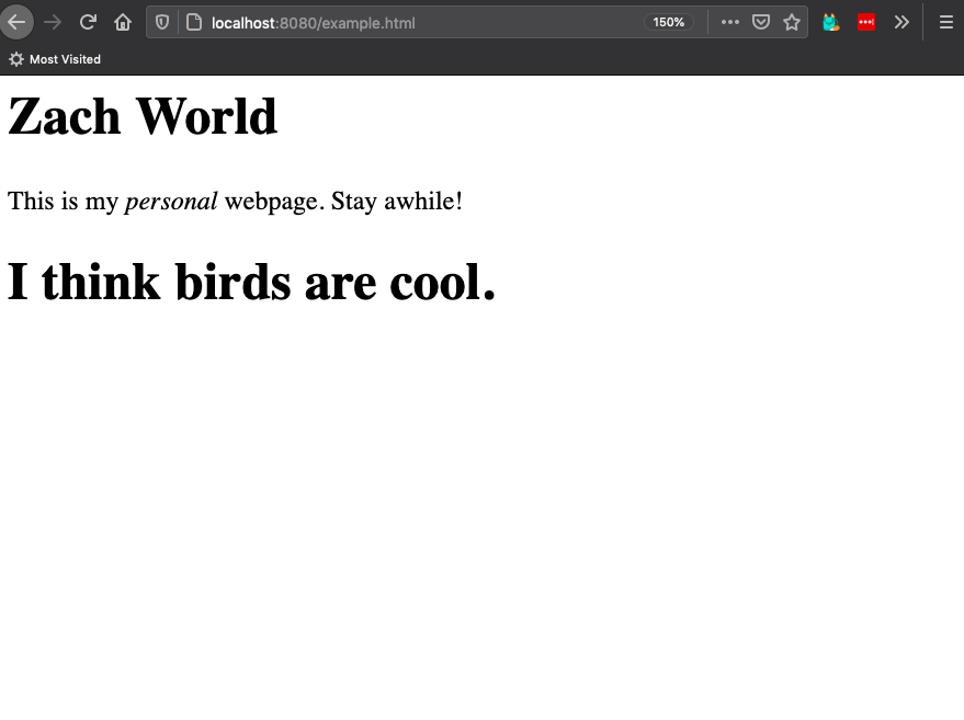
The browser won’t stop me from doing this, but it should still be avoided.
While I got the intended visual effect, my source code makes less sense. The page has two titles of equal importance. This might be interesting as a literary experiment, but will trip up a screen reader.
If you are not writing an Oulipo novel about simultaneity, and you intended to only have one title, then make sure your source code reflects this.
But how we make the text big?
In a future zine, I’ll introduce a styling language called CSS. CSS lets you make the text appear however you want. Make titles extremely small! Make paragraphs solid green triangles! Have flashing lights everywhere!
By letting CSS handle your aesthetics, you can maintain a semantically meaningful document that can move through visual phases alongside you.
In the meantime, a good rule of thumb is that the html should not communicate visual impact, only content and structure. This will give an oodle of benefits as your page grows, including making it accessible to as many folks as possible.
where to now?
We’ve got a nice enough page...but it’s not looking that different from a word document.
It’s not feeling very hyper.
Let’s hyper some text!