This animation uses the well-known if slightly hacky dashoffset SVG technique - it tells the browser/viewer:
‘this line is dashed - - - -, not solid ―. The dashes (and the gaps between them) just happen to be exactly the length of the line. Slide the dashes along the line from a position which is 100% gap, to a position which is 100% dash.’
-> CSS Tricks has a great explanation (with pictures)
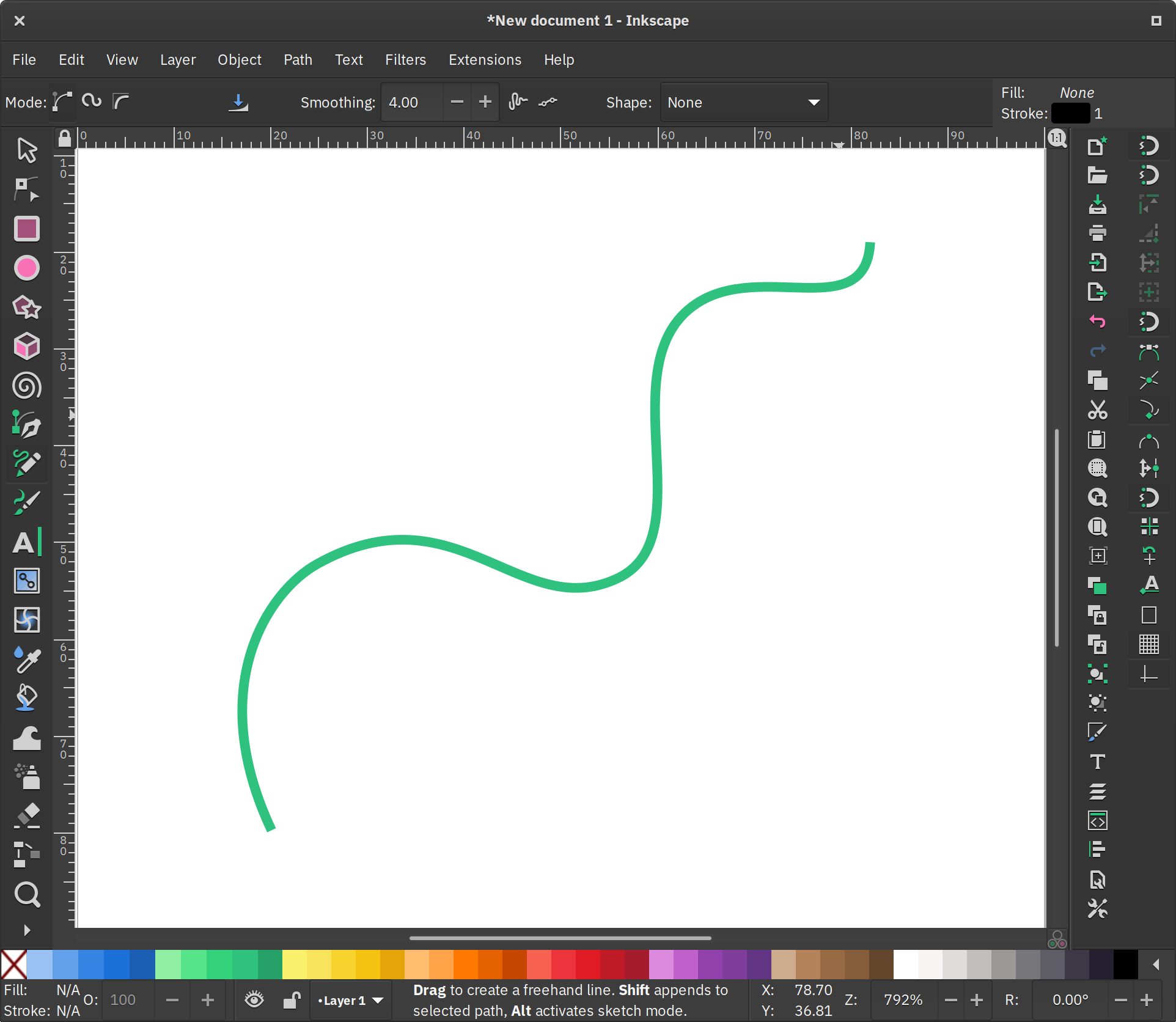
First, create an SVG with a path to animate. Download Inkscape to draw your squiggly line(s)

path. Then use Path->Simplify to reduce the number of nodes. - see how many nodes you can get away with deleting (in general: the fewer the nodes, the smoother the curves.)
 (make selected nodes smooth) or
  (auto-smooth).
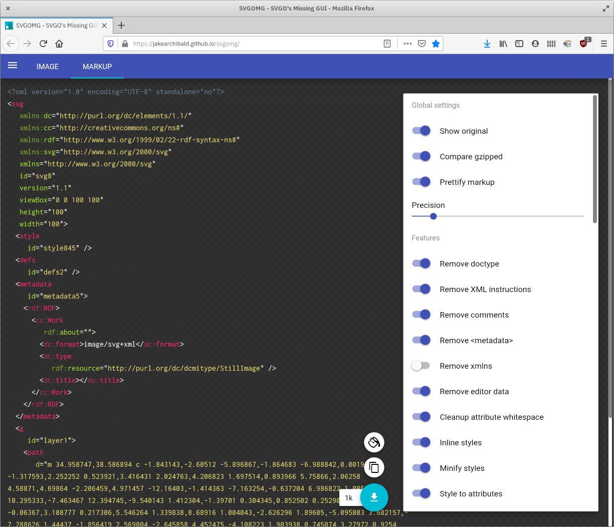
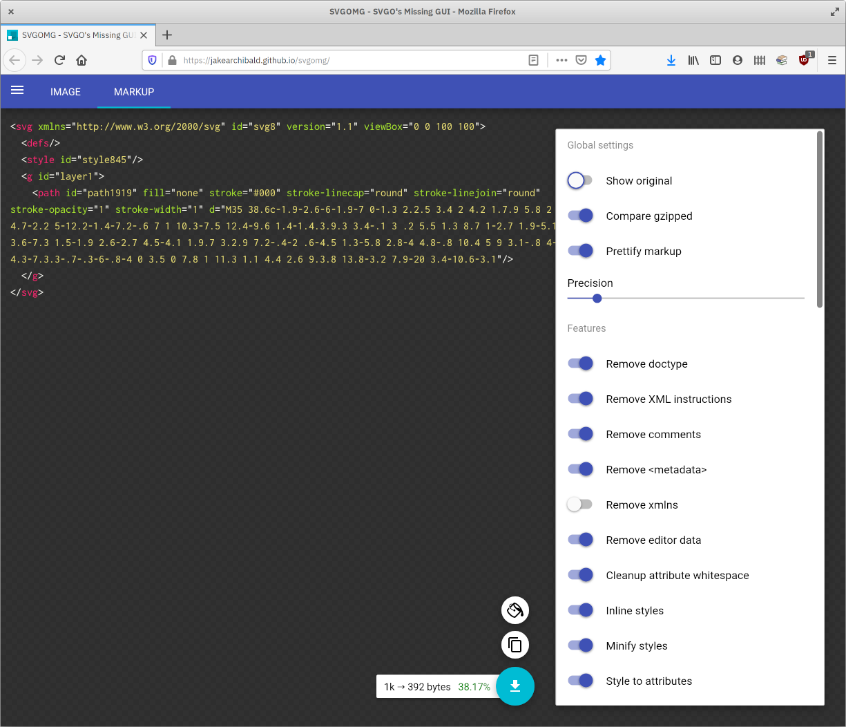
id to each one. I use the Atom editor with the svg-preview package installed, but use whatever tickles your fancy.<style> section - you can copy & paste the animation below, but you can also just go crazy changing background colors and whatever else you like.pathLength attribute to your path, with a value of 1.
        <path id="hello" pathLength="1"
        d="M5 70c24-23 21 81 9 140 24-98 65-68 49-17-6 19 17
        6 27-1 18-12 32-30 28-39-5-10-29-1-32 23-2 15 12 35 40
        16 38-25 37-52 48-110-11 60-18 110-8 110 32 0 50-130
        43-98-10 40-18 89 2 95 23 4 36-11 42-31 2-6 0-11-5-3-18
        26 8 48 26 33 24-20-14-37-14-37s19 7 31-9"/>
1, you can use the same value for your dasharray, creating a dashed line that goes '1 pathLength dash; 1 pathLength gap; 1 pathLength dash; 1 pathLength gap...' and so on.
        #hello {
          stroke-dasharray: 1;
        }
dashoffset property, sliding the dashed line along from a point where it shows 100% gap (dashoffset: 1;), to a point where it shows 100% dash (dashoffset: 0;)
        #hello {
          stroke-dasharray: 1;
          stroke-dashoffset: 1;
          stroke-linejoin: round;
          opacity: 0;
          animation: writeon 20s infinite ease-out;
        }
You can start with this simple animation as a template, if you like - it’s just a single path. Unlike the loop above, this code will play the animation once, then hold. (if you like, you can loop it by adding infinite to the animation declaration).
<svg xmlns="http://www.w3.org/2000/svg" viewBox="0 0 300 300">
      <style>
        #hello { //change to your id name
          stroke: hsl(0, 70%, 63%); //add your chosen styling
          stroke-width: 4;
          fill: none;
          stroke-linejoin: round;
          stroke-dasharray: 1;
          stroke-dashoffset: 1;
          animation: writeon 3s forwards ease; //adjust length (3s) to your liking
        }
        @keyframes writeon {
          0% { stroke-dashoffset: 1; }
          100% { stroke-dashoffset: 0; }
        }
      </style>
      <path id="hello" //add your own path and give it an id
        d="M5 70c24-23 21 81 9 140 24-98 65-68 49-17-6 19 17
        6 27-1 18-12 32-30 28-39-5-10-29-1-32 23-2 15 12 35 40
        16 38-25 37-52 48-110-11 60-18 110-8 110 32 0 50-130
        43-98-10 40-18 89 2 95 23 4 36-11 42-31 2-6 0-11-5-3-18
        26 8 48 26 33 24-20-14-37-14-37s19 7 31-9"/>
    </svg>
Open your animation in a browser to check it (ok, it’s actually worthwhile checking in different browsers to be sure… so download Firefox or Beaker if you haven’t already)
Note: on the ‘sure you do!’ animation at the top, there’s slightly more complicated timing, as well as animated opacity - if anyone wants to know how to set this up, I’m happy to share. (Or you can just download the image and check it out with a text editor!)
A tiny bit of Javascript is required to make this animation, but not to display it: you just need to know the exact length of your path if you want to animate it like this. You don't need to know anything about Javascript to do it, just follow along!
If you just include the following <script> before the closing tag, and open the SVG in a browser, you’ll see the total length of the line (1164.4000244140625 for my ‘hello’ line) calculated and displayed in the browser’s dev tools (right click-> Inspect Element -> Console).
      <script>
        const path = document.querySelector('path');
        const pathLength = path.getTotalLength();
        console.log(pathLength);
      </script>
(You can replace document.querySelector('path') with id names if you have multiple paths in your SVG - just replace 'path' in the querySelector with, for example, '#your-id':
const path = document.querySelector('#hello');
If you already tried the CSS method above, you should remove the pathLength="1" property we put in earlier. This time we're going to use the actual length of the line. You’ll need to copy the length of your line from the browser console, round it to a single decimal point or so, and set it as the stroke-dasharray value for the line in the style section.
Also set stroke-dashoffset to the value of your line length, and in the animation, animate stroke-dashoffset from your line length to zero. If it writes on backwards, add a minus before your line length to make it negative.
An interesting area you might want to explore next might be combining this effect with clipPath (Here's a wonderful in-deptharticle about SVG clipping from Sara Soueidan). Here, for example, I've used Inkscape's trace functionality to vectorize Angelica's beautifully fuzzy yogi tea illustration.

I then made the stroke widths of my paths thicker than the original vapor trails, and used clipPath to only show the parts of my paths within the shape of the pixeled vapor trails. Then I was able to animate the stroke-dasharray to draw a pixeled stroke onto the screen. To make the steam, I had to make some copies and layer them at different opacity levels, pick different dasharray lengths for each one, plus randomize and offset the timing of the different strokes' animations. Here's the result:

Have fun exploring all the possibilities of SVG and CSS animations!